
21st February has been officially celebrated as International Mother Language Day for over two decades now. The love of the Bangla language is something extraordinarily special. As Banglais, we have always been proud of the fact that we are the only race who have fought for our right to speak our mother tongue. However, this generation has a different relationship with language than those who were part of our language movement and our liberation struggle, perhaps due to globalisation, our upbringing or even circumstance. While we will never understand their struggles, we love the language in our own way, we simply express this love differently.
One of the ways of expressing one’s love of this romantic language is through art. We reached out to a few artists who do just that- express themselves through art and typography. Just as there are certain things that can only be expressed in Bangla, there are certain emotions that can only be expressed through art. They talked about their influences, and their love of art and their mother tongue.

Debashish Chakrabarty is an artist and author. He was born and grew up in Dhaka, the capital of Bangladesh. A photography graduate of the capital’s Pathshala South Asian Media Institute, he has been using diverse kinds of optical, photographic, and drawing techniques to narrate stories that reflect various degrees of human experiences.
https://www.debashishchakrabarty.com
How would you describe your relationship with the Bangla language?
Bangla is my first language, and I function in Bangla. On the other hand, English is my second language. Bangla as my first language is the language through which I understand and navigate the world. It shapes my perceptions and understanding of reality. It is also a reflection of my cultural heritage and the environment in which I was raised.
 Why have you chosen this particular artwork? What is the concept or the feelings behind it?
This artwork is from my ongoing series of drawings and collages যুগ যন্ত্রণা (Juug Jontrona). It circles the Bangladesh state and the population that this state addresses. We have achieved a modern state mechanism, however, it lacks the authority and objectivity to fulfil the external needs of the population. But where is the art in it?
Why do poets write poetry? Why do we sing? Because something tangible or intangible moves our physical or spiritual existence, and one tries to manifest that with a given medium. So, why should an artist discard the power relation that shapes the very mundane life? My drawing and collage series is an exploration of the state mechanism in Bangladesh and its impact on the population it addresses. Through a combination of traditional drawing techniques and collage, I aim to examine the power relations and cultural politics that shape the way people live and interact with one another in this country. I am particularly interested in exploring how power and authority are represented and exercised in Bangladesh, and how people resist or comply with these structures. I use not only the imagery of everyday life but also the colloquial phrases of the mass as the material, to create a sense of familiarity and a sense of place.
What are your future plans?
I wish to be less influenced by the conventional definition of art and the context of art and be more engaged with the power relations and cultural politics that shape countless lives and fates in Bangladesh.
Kazi Istela Imam has been working as an illustrator and graphic designer for about 10 years now. Besides working on books, branding, and social campaigns for different organisations and brands both locally and internationally, she is establishing her own practice which is a bit more mixed media based. Text and typography is a key component of most things she makes.
How would you describe your relationship with the Bangla language?
I am certain my mother wouldn’t be very proud to hear me deliver a speech in Bangla (laughs nervously) but jokes apart, my relationship with Bangla has always been more visual. I have always enjoyed writing it in different styles, admiring the uniqueness of the letters. I love the play of words when speaking – there’s a particular expression of humour that is only possible in Bangla and quite difficult to replicate in English. I especially like how you can communicate certain sounds and add connotations by repeating or rhyming the words, eg. হীম সীম , বক বক ,ঝক ঝক , ঝম ঝম বৃষ্টি !
Why have you chosen this particular artwork? What is the concept of the feelings behind it?
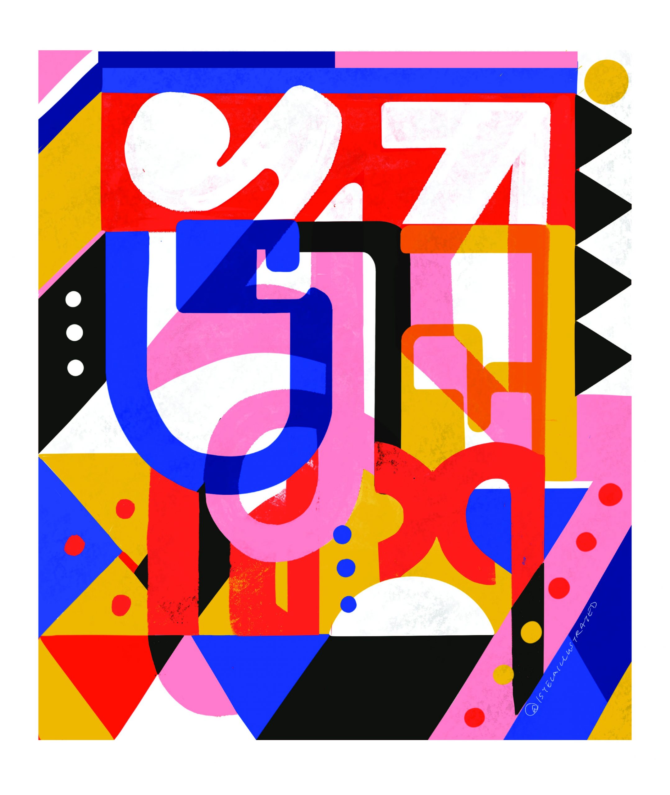
I have a fondness for solving composition problems and watching how shapes and colours interact with each other and ultimately coexist in harmony. I like working with different Bangla words – the colours, look and feel of my typographic illustrations are often inspired by the meaning of the words. It may not be instantly legible at first glance and usually requires a bit of engagement by the viewer to read what the poster actually says. In one of my series, I gave alphabets a title because of the words they start with, for example, The Curious Case of ক – কৌতুহলী ক because কেন, কোথাও, কখন, কি, কোই, etc., The Hopeful হ because হবে, হয়তো, হতে পারে, হয় and দি দয়ালু দ because দাতা, দয়া, দান, দোয়া , দেই, দেয়া.
What are your future plans?
Plans are at a dream stage right now but I would love to have an exhibition showcasing my personal works. I also wish to launch my own brand of cool funky Dhaka inspired fashion and lifestyle products someday which will include a lot of typography of course.
Helikon is currently doing his undergraduate in Anthropology at Dhaka University. He has been working with designing mass communication solutions and typography since 2015. The mechanism of human interaction and its uses never ceases to amazes him. He believes in usability and human experience. He designs human-centred communication policies and promotions. He also loves exploring the curves of typefaces and letters. He has a keen interest in Bangla typography.
How would you describe your relationship with the Bangla language?
My relationship with Bangla is like my relationship with my mother. After all, it is my mother tongue – it was in me even before I could talk. Language and individuals are closely related and cannot be separated. Local wisdom is the wisdom or original knowledge of a community or of a person, and a native language is a core part of the local wisdom. I think in Bangla, I comprehend in Bangla and I express myself in Bangla. Moreover, languages symbolise identities, and typefaces or letters symbolise language. My love for the language can’t be separated from my love for the letters. So in a nutshell, it’s মায়ের মতোই ভালো (as good as my relationship with my mother).
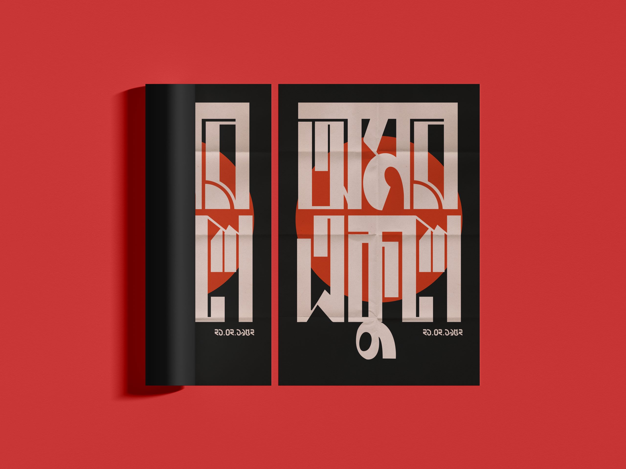
Why have you chosen this particular artwork? What is the concept of the feelings behind it?
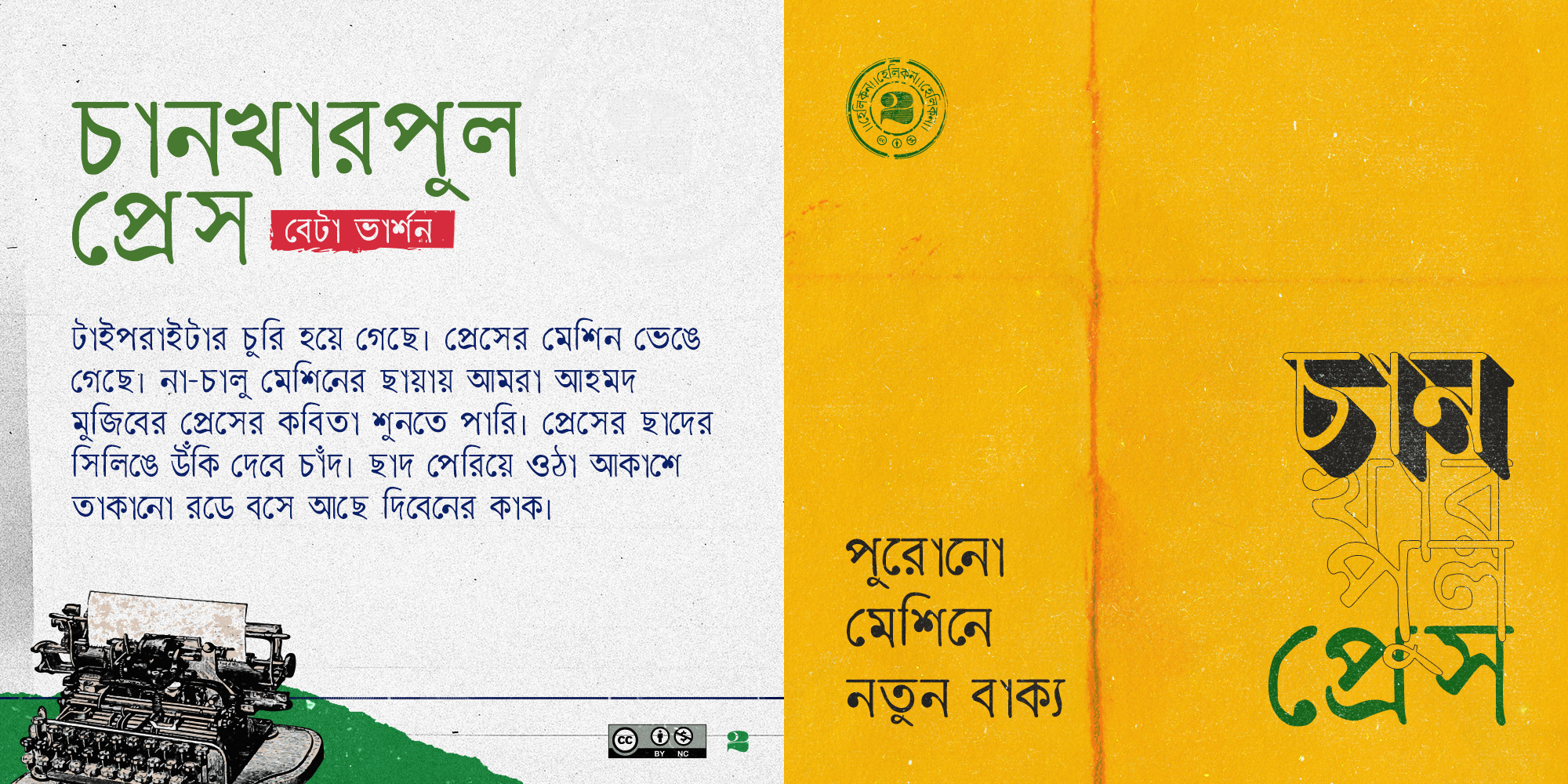
This piece is probably not legitimate artwork; it’s more like advertising material. But I insist on showing you this one because it depicts one of my works which was the prime reason for this art endeavour, Helikon. It refers to a feature of the Chankharpul Press beta typeface, which to me is a valuable creation. Every time I put my time and effort into it, I was able to experience some kind of excitement. As it is a self-funded project and because I also have to maintain my studies, and livelihood, along with other engagements, I am yet to complete the full version of the typeface. This image serves as a reminder to me. Helikon is an experiment with which I began to explore the curves and appearance of Bangla letters. Back in 2015, I used to collaborate with my mentor-peer Sashoto Seeam on a project called Design Protidin. Design Protidin tried to improve the accessibility of Bangla design resources so that people could practise and learn design with ease. At the time we struggled to find nice, legible and usable Bangla typefaces. The internet is flooded with beautiful and diverse styles of fonts in English and even other languages, but Bangla fonts were limited. That’s why I started learning Bangla letters and typography – one day I would like to design readable and beautiful typefaces and turn them into useful fonts. Currently, there are a lot of activities going on in our country surrounding the development of Bangla typeface, but I believe it is still far from sufficient.
Since childhood, I’ve been drawn to vintage things. I love old books; their covers and the stained, browning pages. I’m so mesmerised by those old books with deformed ink prints that used to emerge from the press. As a result, I decided to create a typewriter typeface and named it after an area in Puran Dhaka. It reminds me of those gorgeous, old book covers. It makes me nostalgic as if I’ve just discovered something precious I had lost somewhere, long ago. Like a হারানো সুর (lost tune) to an old passionate harmonica.
What are your future plans?
For now, all I want to do is publish the full version of my unfinished typeface, Chankharpul Press. Then, I need to get started on some more typefaces I have in mind. Apart from that, I have a plan to digitise or preserve the handwritten letterings on signboards, rickshaws, buses, trucks, walls, and everywhere else we encounter them in our everyday lives in Dhaka city. These letterings are being phased out in favour of digitally produced fonts. Furthermore, because my major is Anthropology, I would like to do an ethnography on Dhaka’s lettering artists. The majority of lettering artists have spent their whole lives doing just that. It was a familial tradition for many. I’m interested in how they used to keep track of their lives through letters, what it means to them, and how digitisation has affected their lives.
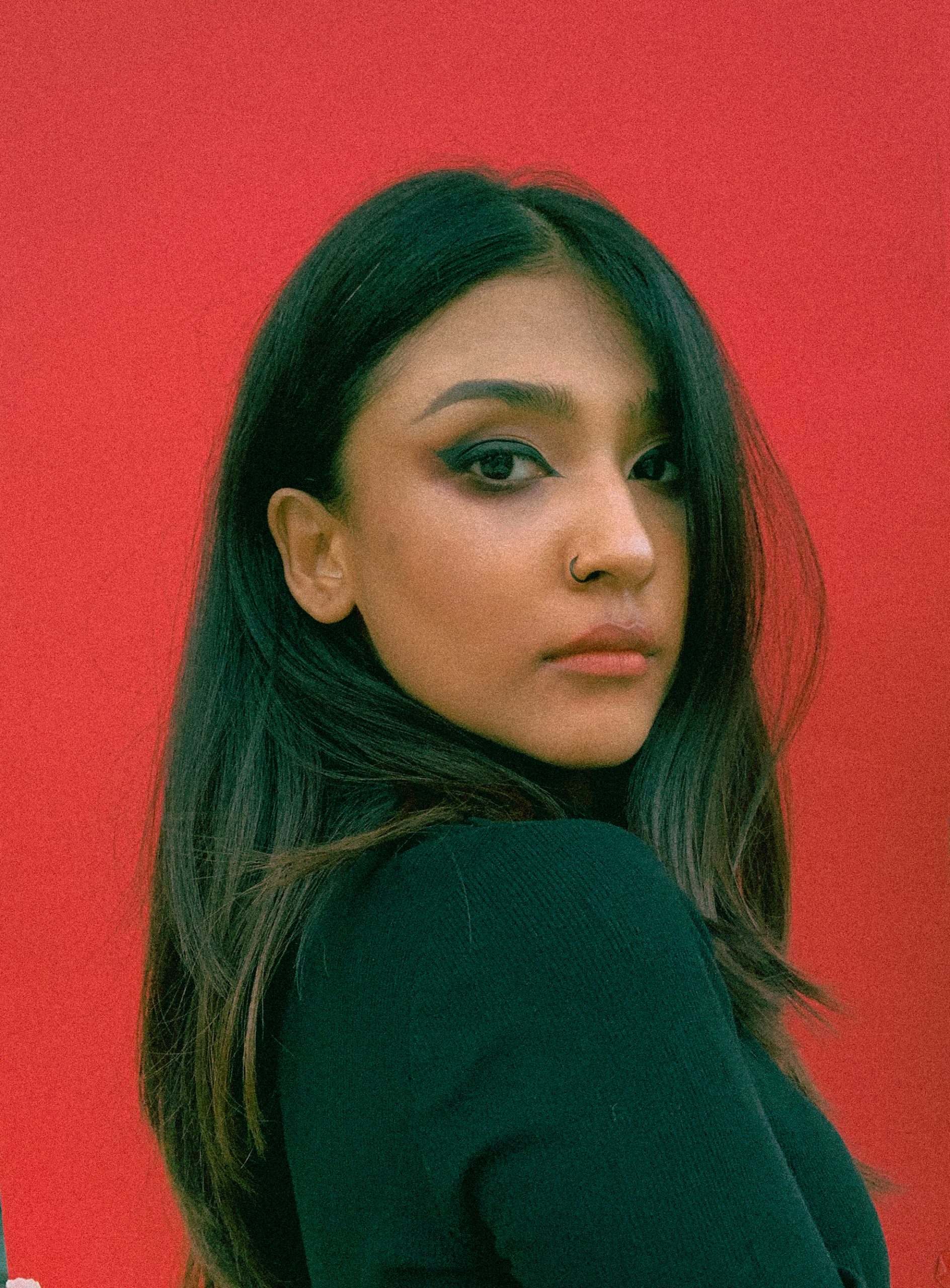
Waseka Ahmed is a visionary artist and multidisciplinary designer whose work defies easy categorisation. She has a talent for creating visually stunning art with a strong message. Her expertise in advertising and design spans more than five years, and she is currently working as an art director.
Waseka’s art is a reflection of the beauty and complexity of the human experience by masterfully combining different mediums and techniques. It is her philosophy to experiment and push boundaries, always seeking exciting directions for her art. She has worked on social issues and her very recent, and well-received project –Dark and Lovely – focuses on the South Asian taboo of dark-skinned women. Her collaboration resonated with millions of women in the region and quickly became viral. Addressing this social stigma, she was invited to attend TEDxEMWS Mumbai, India as a speaker.
How would you describe your relationship with the Bangla language?
Language is also an integral part of our identity. In my youth, I found Bangla difficult, to be honest. I’d call it a rocky relationship. But my love for the Bangla language, which is known for its beauty and eloquence, bloomed when I started learning typography. I fell in love with the language when I began to understand and appreciate the melodic and expressive qualities of the language. I also began to appreciate the beauty of each letter form and the history behind it. Returning to my roots has been a rewarding experience for me.
Why have you chosen this particular artwork? What is the concept of the feelings behind it?
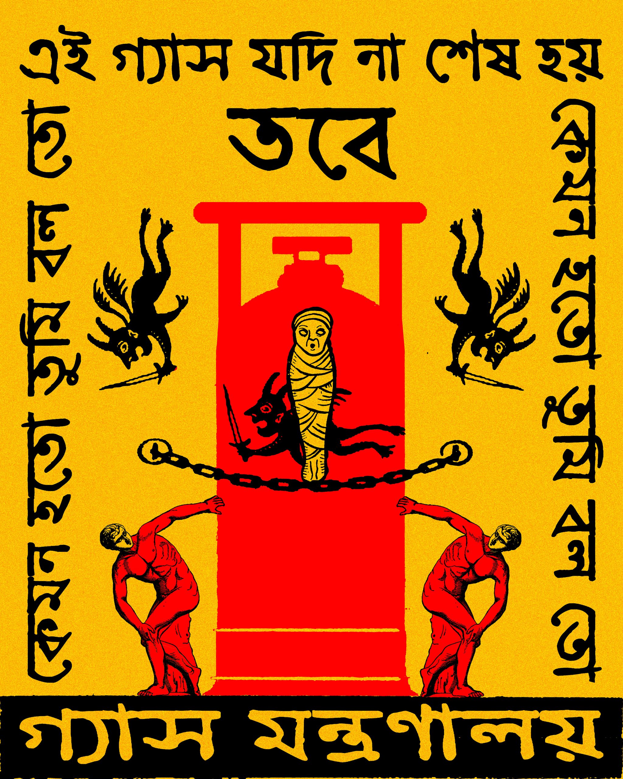
As an artist, my style has evolved over the years. Finally, I am able to express my true, authentic self through my artwork. The artwork that I have chosen represents me, my culture, my heritage, my language and Bangladesh’s history. As I tried different art styles and mediums, my interest in typography grew. Every artist has a unique perspective, which is shaped by where they were born, how they grew up, and the language they use to express themselves. Despite my desire to be a global artist, there are some things that set me apart from everyone else, which are my culture, and my country of origin. I am proud to represent all of that through my artwork. This artwork is a reminder of how a peaceful protest turned into an atrocity and its turning point was the Language Movement Day. Our hearts remain deeply affected by the tragic events of that day, which I expressed through this art. The dark colour depicts a sense of mourning for the senseless loss of innocent lives on that day. The red colour represents bloodshed. The powerful bold typography accentuates these emotions even further.
What are your future plans?
My future plan would be to have my own studio. I would like to continue to create art and inspire others with my artwork. I want to show my work in more exhibitions and art galleries and have more engagement with my audience through various platforms. In addition, I want my heritage and culture to be a constant source of inspiration.