
In an exclusive interview with ICE Today, Sabyasachi Hazra, spills the beans about his plans to foster an appreciation for typography among the future generation.
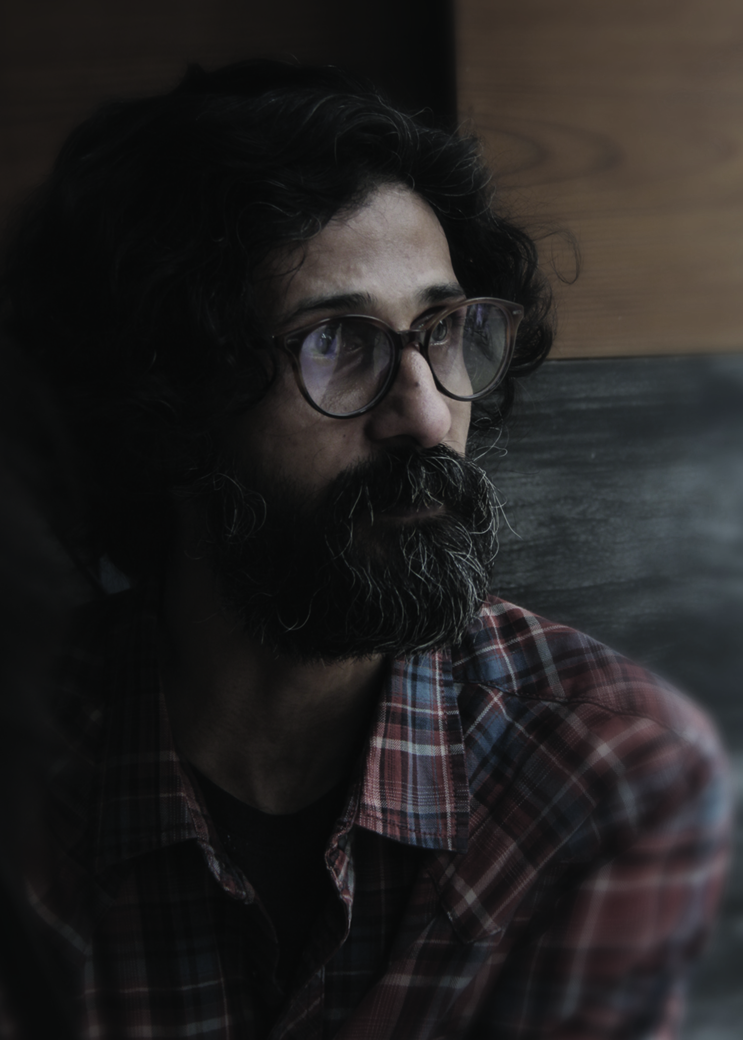
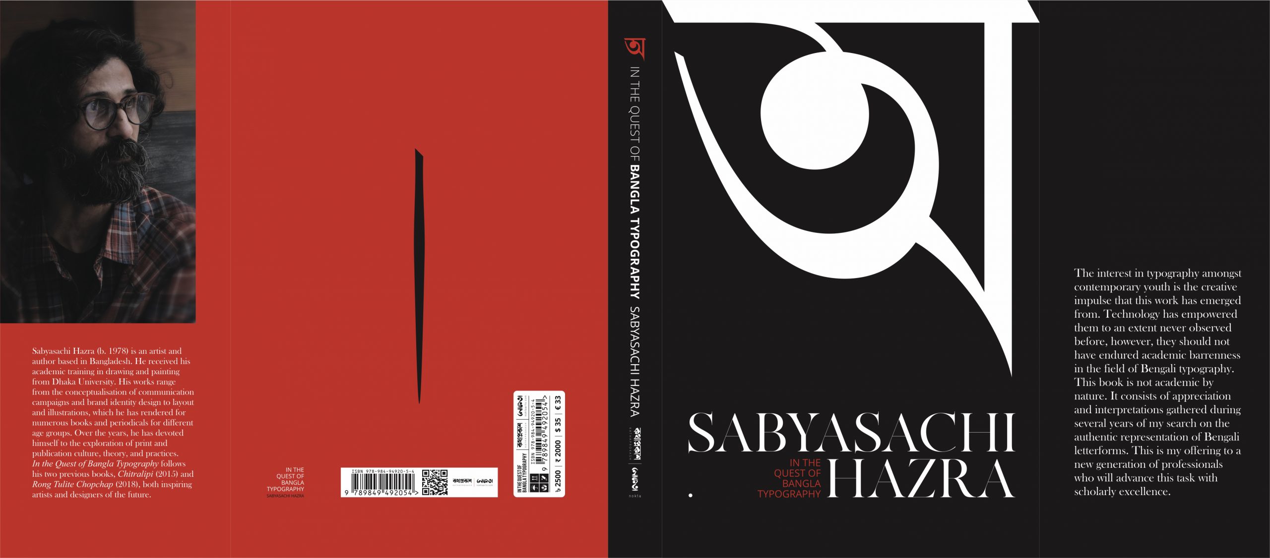
Sabyasachi Hazra is one of the most prominent artists of our time. Regarded as an inspiration for young artists, he is known for his prolific contribution in the domain of design in print media, illustration and typography. Hazra earned his master’s degree in Fine Arts from the University of Dhaka. From delving into the depths of Bengali typography, designing book covers and creating some of the most famous artworks of our country, such as the iconic Mujib Sotoborso logo, he is celebrated for his publications revealing his thoughts around art and the alphabet. He has recently published his book অ- In the Quest of Bengali Typography, which explores the aesthetics of Bengali typeface. The book aims to foster an appreciation for typography among the younger generation and provide an overview of the evolution of Bengali scripts.
What makes typography such an integral part of a language’s evolution?
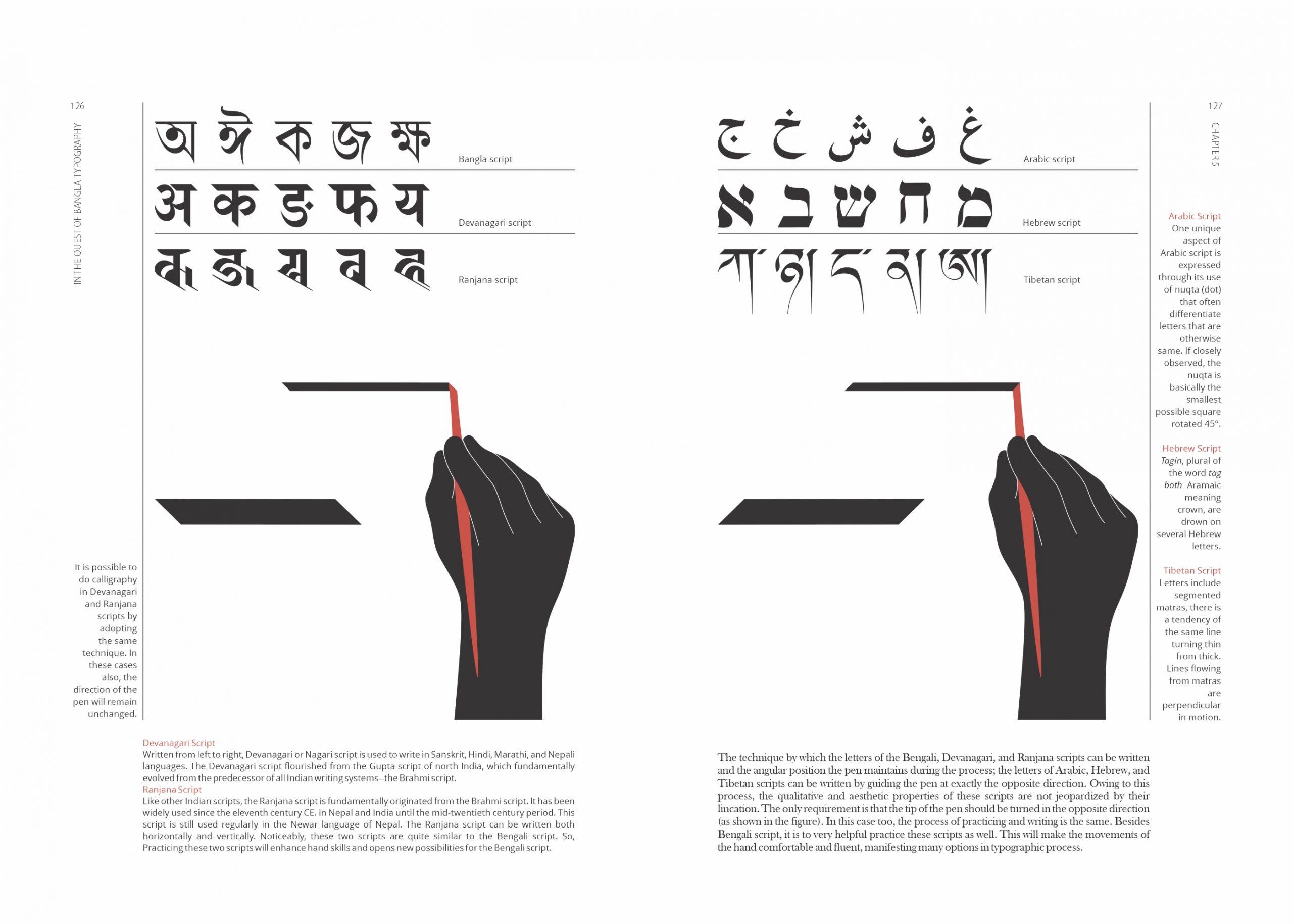
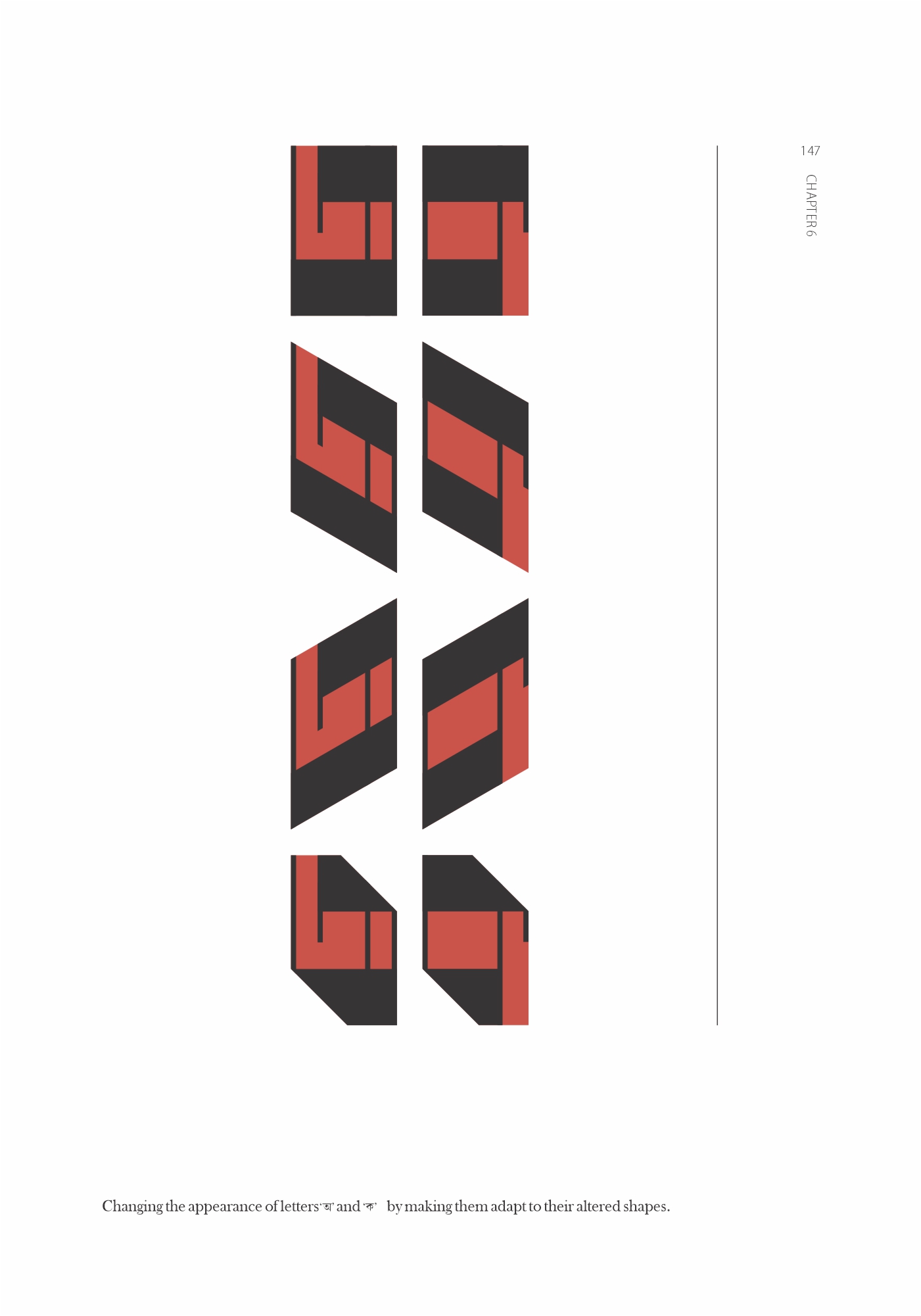
Similar to languages of speech, fonts are also rapidly evolving. Therefore, it is imperative to understand letters from a linguistic stance and analyse them aesthetically and practically from a typographic perspective. Structures and figurative styles of fonts culminate into a diverse range through time, technology, medium, application, subjective perception and aesthetic examination. Unfortunately, the discussions or documentation pertaining to font, handwriting, typography, typeface and arrangement of letters of the Bengali language, which contributes to its spontaneous development, have been insufficient to date.
You have previously mentioned that there has been a gradual loss of the aestheticism surrounding Bengali typography. What has led to degradation over the years?
As society progresses towards digitalisation, traditional forms of written expression, such as the standard typeface and calligraphy, are increasingly being undermined and forgotten. The shift towards more modern and digitalised forms of communication has diminished the value placed on these historical and cultural practices. While modernisation brings new technologies and advances, it is vital to preserve and value the traditional methods that have been passed down through generations.
Use of technology delivers quick output, but mastery will only be achieved through rigorous practice. There is no shortcut; as a child needs to learn how to hold a pen and write a letter, an artist or typographer needs to experience calligraphy and typography manually. Needless to say I am not against technology, but to leverage it, you need to know what to achieve, how to achieve and where to end. Otherwise lack of sense, taste and preparation will result in gradual degradation.
There is no shortcut; as a child needs to learn how to hold a pen and write a letter, an artist or typographer needs to experience calligraphy and typography manually.
Your latest book, অ- In the Quest of Bengali Typography, explores the aesthetics of Bengali fonts across eight chapters. What was the creative impulse behind the publication? How will this book aid the next generation of typographers or artists willing to delve deeper into the evolution of Bengali letter fonts?
 Catalysing the interest in typography amongst contemporary youth has been the creative impulse behind the work. Although the proliferation of technology has enabled our youth to achieve remarkable feats, academic barrenness in the field of Bengali typography is frustrating. This book is not academic by nature. It consists of appreciation and interpretations gathered during several years of my search for the authentic representation of Bengali letterforms. This is my offering to a new generation of professionals who will advance this task with scholarly excellence. This publication provides an overview of the evolution of Bengali scripts. It’s the first of its kind to focus on the route to discover the standard form of Bengali letters and reach the destination of versatile typography. Since there is no categorical precedence of publication related to Bengali calligraphy and typography, this piece of work or proposition is being stipulated within the periphery of analysis. I hope the idea will be further improved through post-publication feedback and refinement by our next generation of language professionals.
The book’s launching was paired with an exhibition titled Brahmi to Bengali, which showcased the origins of Bengali alphabets. Could you tell us a bit about the purpose it served and how the exposition ties into the objective of the book?
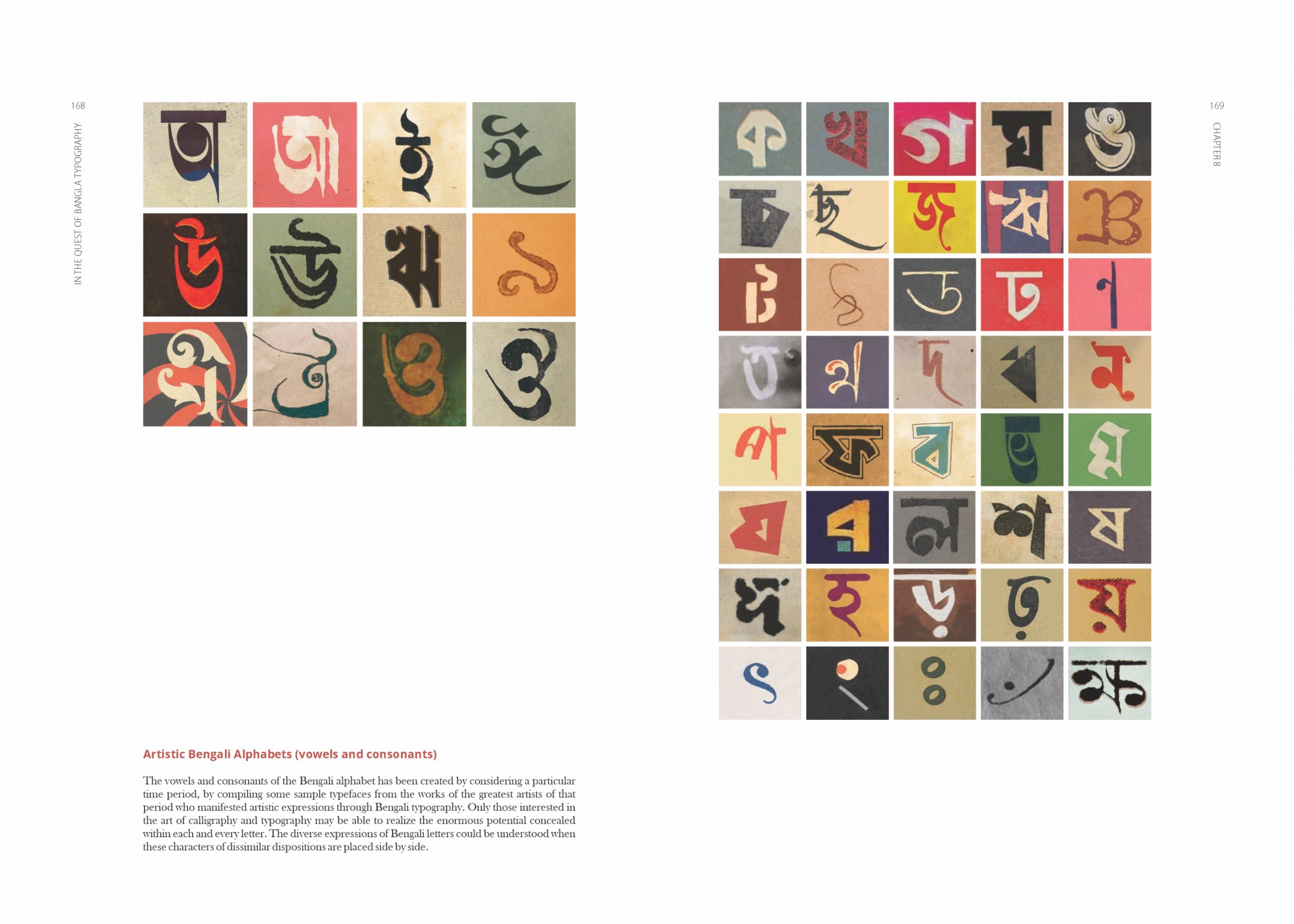
The exhibition was designed to share my inspiration behind the publication and also to connect a broader audience with the objective of the work. Attuned to the aim of the book, it also aspired to initiate conversations revolving around the Bengali scripts. While the publication could be useful only for artists or professionals, the exhibition wanted to bridge the gap and share the thought with the audience from different backgrounds to make them more curious about Bengali scripts and the aesthetic of Bengali calligraphy and typography. To this end, the exhibition displayed 21 of the 170 handmade tools used to do Bengali calligraphy . Also, the exhibition displayed a video explaining the contents of the book and the artworks on display. At the same time, it featured an artwork titled, Artistic Bengali Alphabet”, featuring 52 Bengali vowels and consonants designed by illustrious personalities like Satyajit Ray, Quamrul Hassan, Panchanan Karmakar, Madan Mohan Tarkalanker, William Bolts, Pranesh Mondal, among others.
অ- In the Quest of Bengali Typography is your first book in English on the topic. How crucial is it to disseminate information about Bengali fonts to an English-speaking audience?
 The book is about Bengali calligraphy and typography and not necessarily limited to the Bengali speaking population. I would like to acknowledge the contribution of Fiona Ross and Jacob Thomas who made significant contributions in the domain of Bengali typography and typeface. Bengali typography and calligraphy cannot be advanced in isolation, and need exchange with a global audience. I could also see a big group of young professionals working with Bengali typeface have been coming from English medium backgrounds, expats and outside the country or Bengali origin. As a bilingual version with Bengali and English both would increase the size and reduce affordability, I wanted to keep it English and thus let it open for diverse groups. The book being more pictorial and having a lesser amount of texts, I assume the medium chosen as English would not create inconvenience for the target group rather widen the access to others who can read, refer and review it and thus serve the purpose of the publication.